UI / UX CASE STUDY

Chat App Landing Page & Website

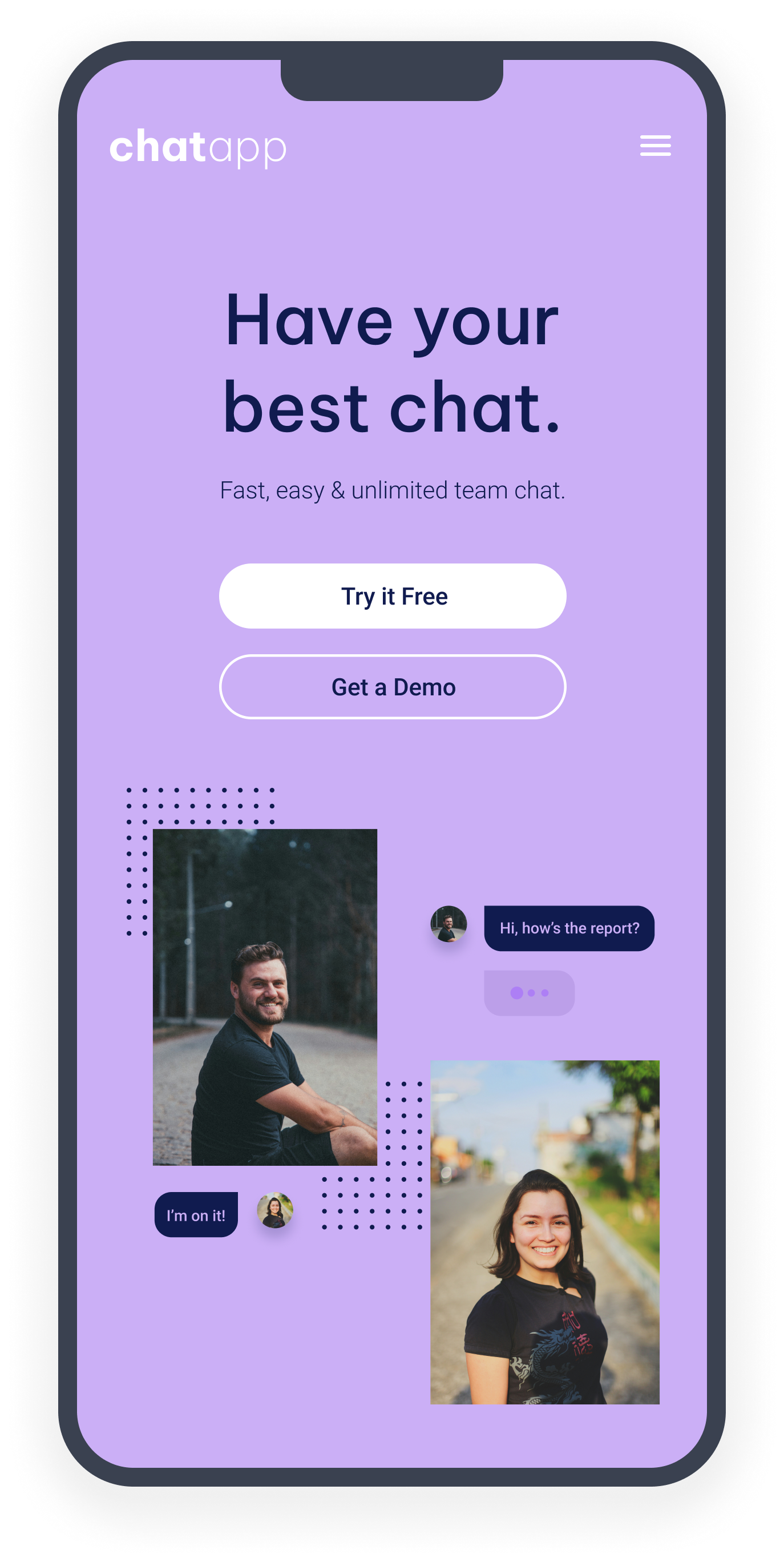
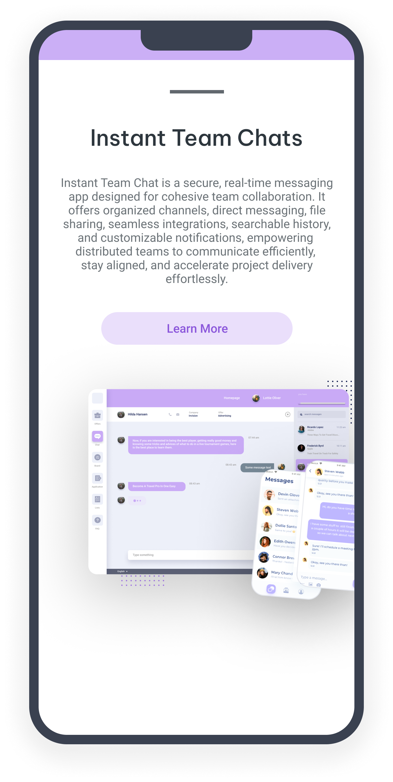
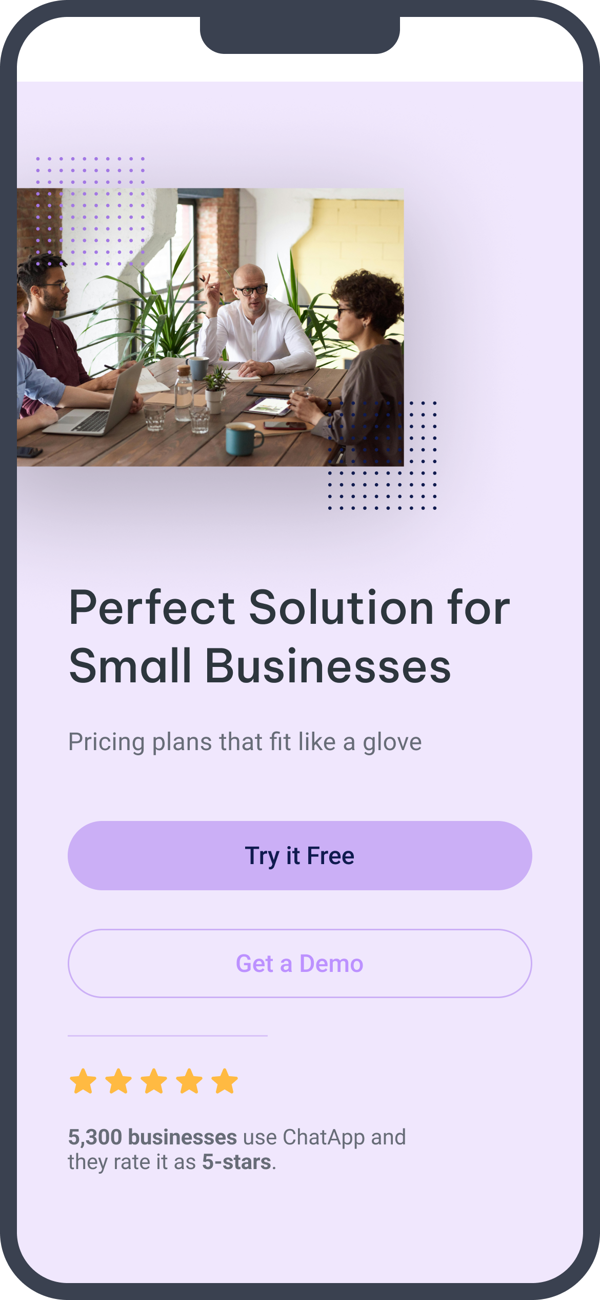
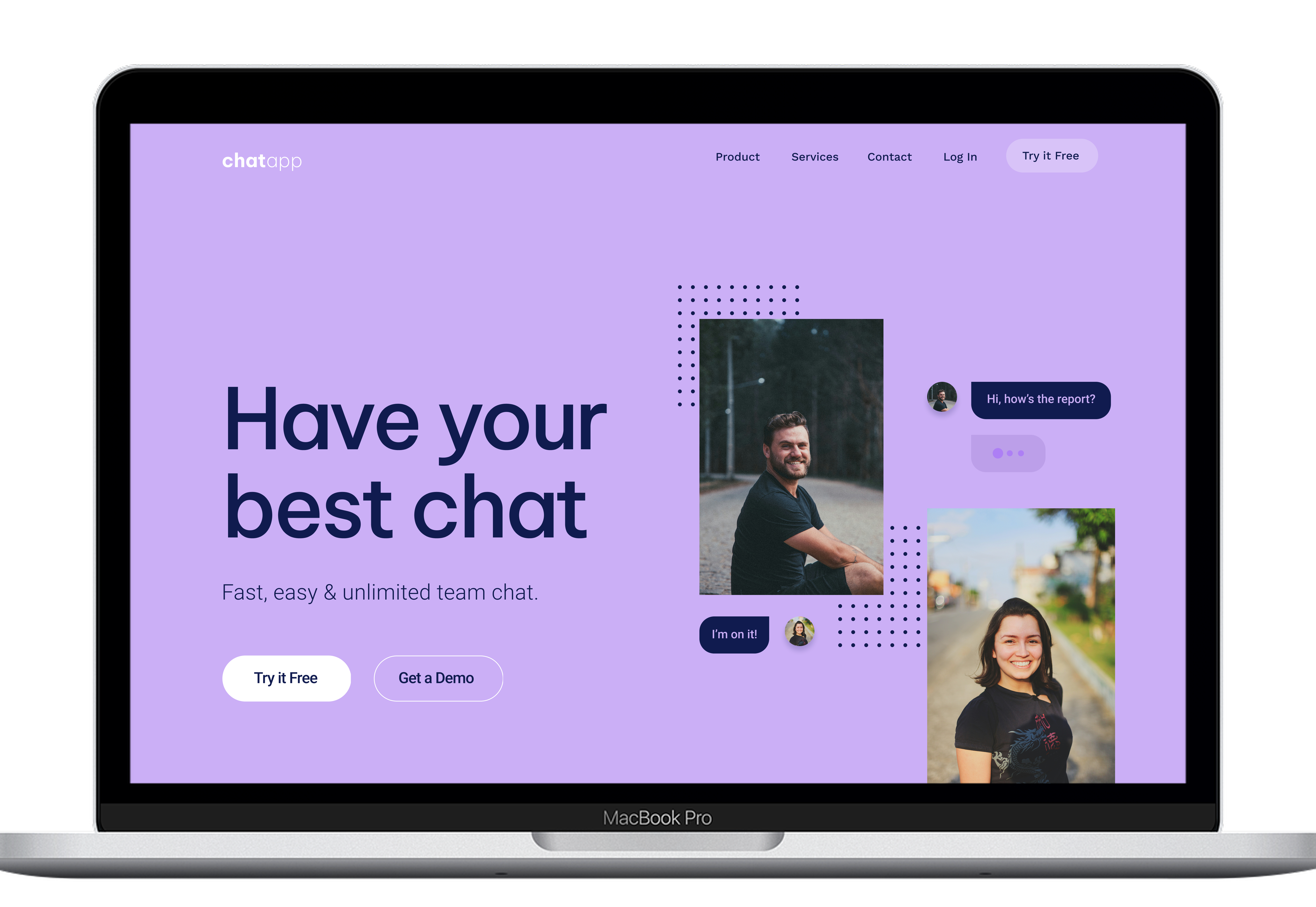
A high-converting marketing experience for a team chat product, designed in Figma and shipped live in Webflow with a clear hero, trust-building proof, and one strong call to action.

RoleUI/UX & Web Designer
TypeSelf-driven project
ToolsFigma, Webflow, WAVE
Live SiteWebflow
Landing Page Marketing Design Accessibility
View Live Site Read the Study
01 / Project Introduction

The Goal

I wanted to design and ship a responsive marketing page for a team chat product rather than leave the work as a static mockup. The challenge was simple but important: turn a visitor into a sign-up through clear messaging, strong trust signals, and a frictionless path to action.

This was a self-initiated project, so I defined the audience as small teams and startups looking for a simple chat tool and built the page around the hesitation they would likely feel before committing.

Project Focus

  • Turn visitors into sign-ups
  • Make the value obvious immediately
  • Build trust before asking for action
  • Deliver a fully responsive experience
02 / Approach & Decisions

Approach and Key Decisions

I structured the page around the way a visitor actually decides, so each section answers a specific question before asking for the next action.

Hero

  • Lead with the product's core value in the largest type
  • Keep the first screen free of distractions
  • Position the primary CTA as the next obvious step

Features & Social Proof

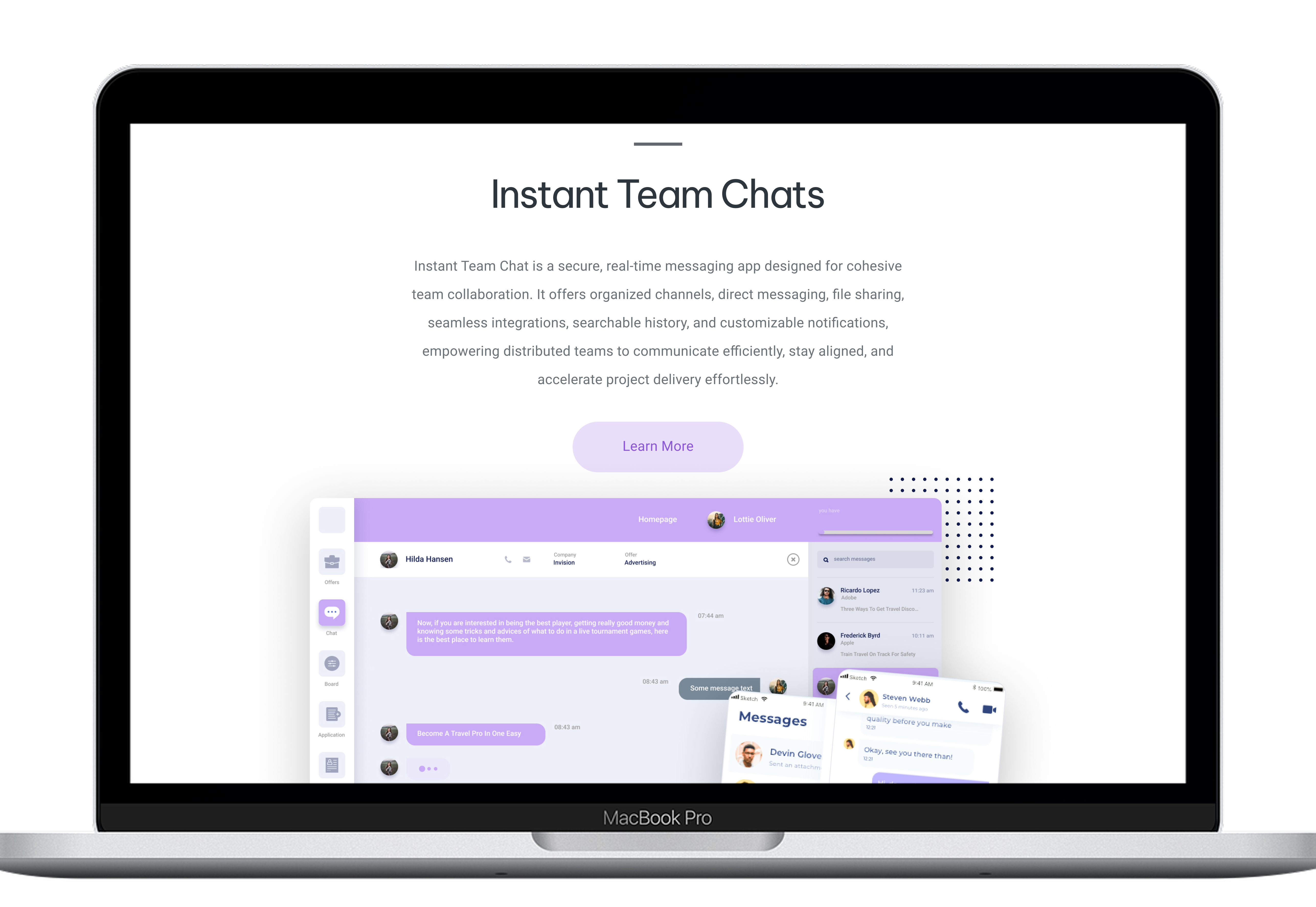
  • Frame features around user benefits rather than feature dumps
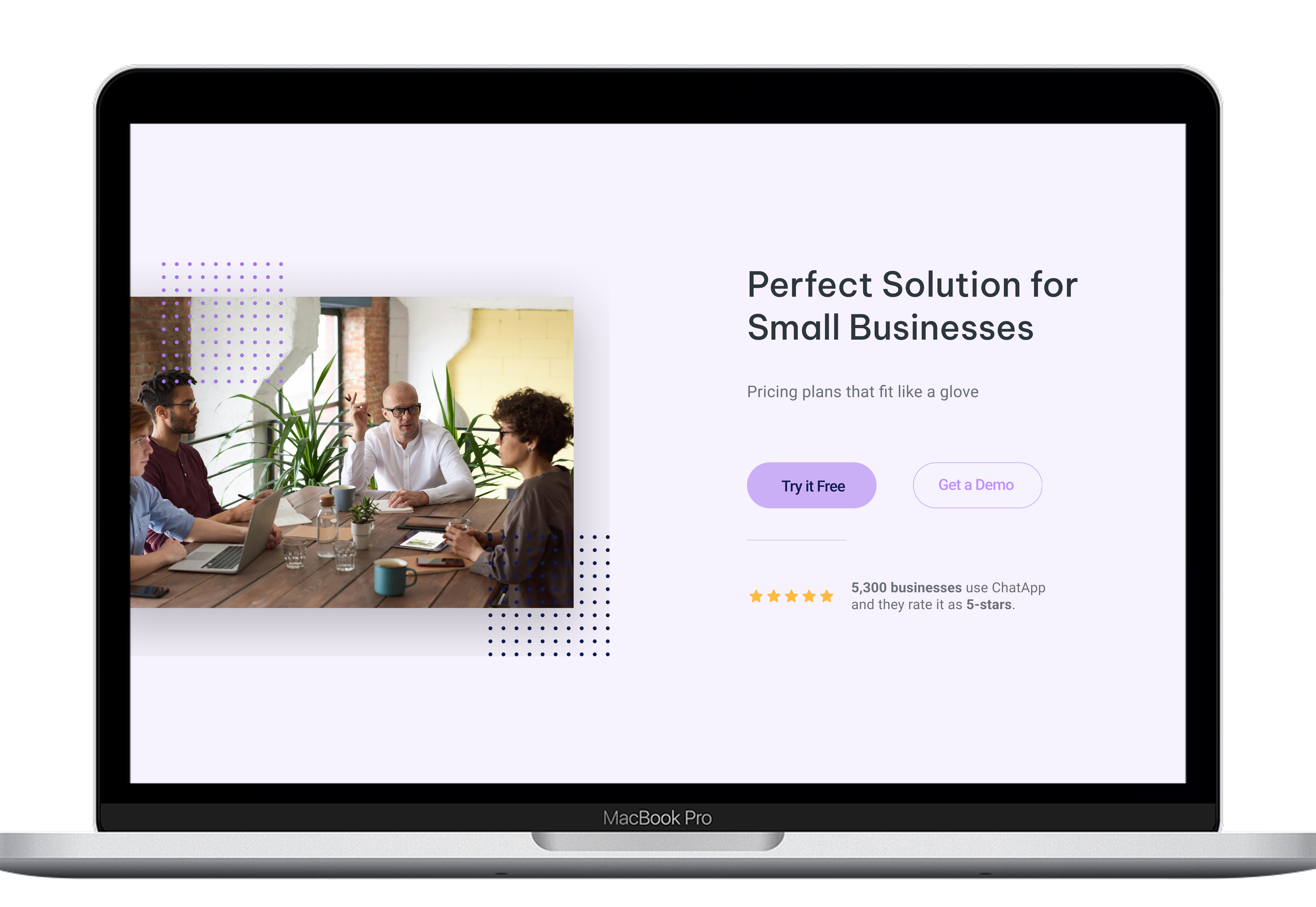
  • Use logos and testimonials to handle trust early
  • Repeat the call to action so the conversion path stays clear
03 / Visual Design

Visual Design

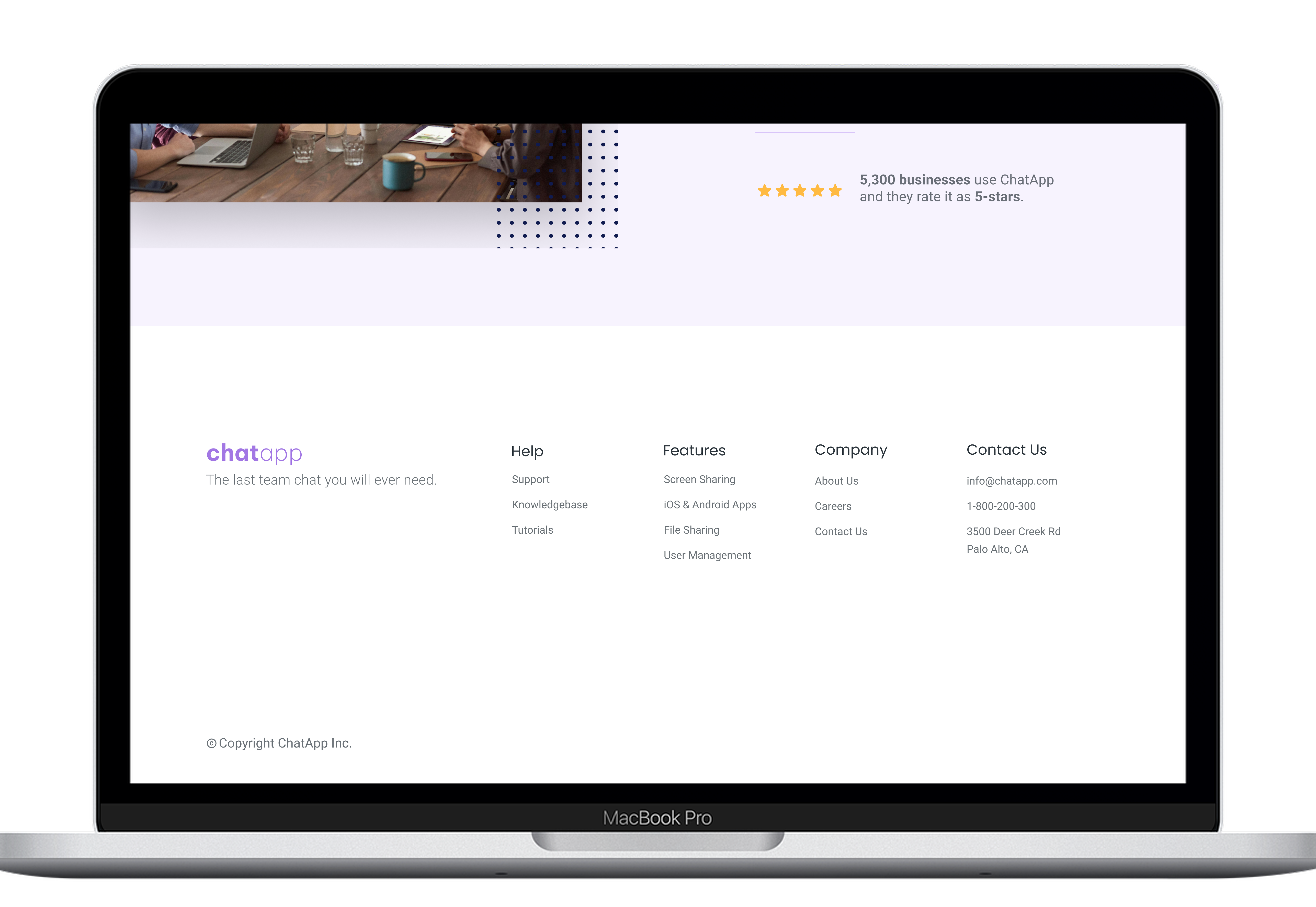
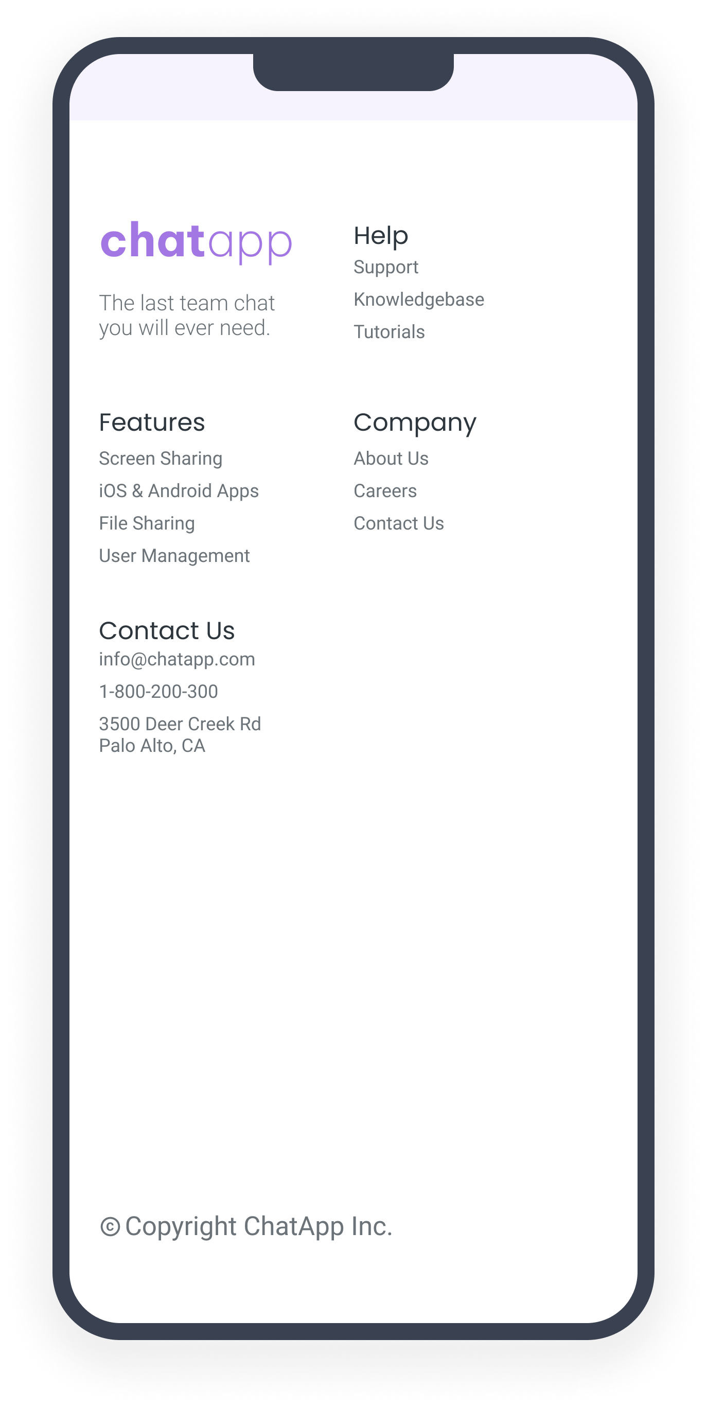
To make the page feel like one coherent product, I built it around a consistent visual system with strong hierarchy, rhythm, and spacing. Type scale, spacing, button styling, and section rhythm were kept consistent so the experience felt polished from top to bottom.

I designed it in Figma first to lock in the visual system, then rebuilt it in Webflow so it could live as a real, responsive experience across mobile, tablet, and desktop.

Design Principles

  • Strong visual hierarchy
  • Generous spacing and breathing room
  • Consistent buttons and section rhythm
  • Responsive layout across devices
04 / Accessibility

Accessibility

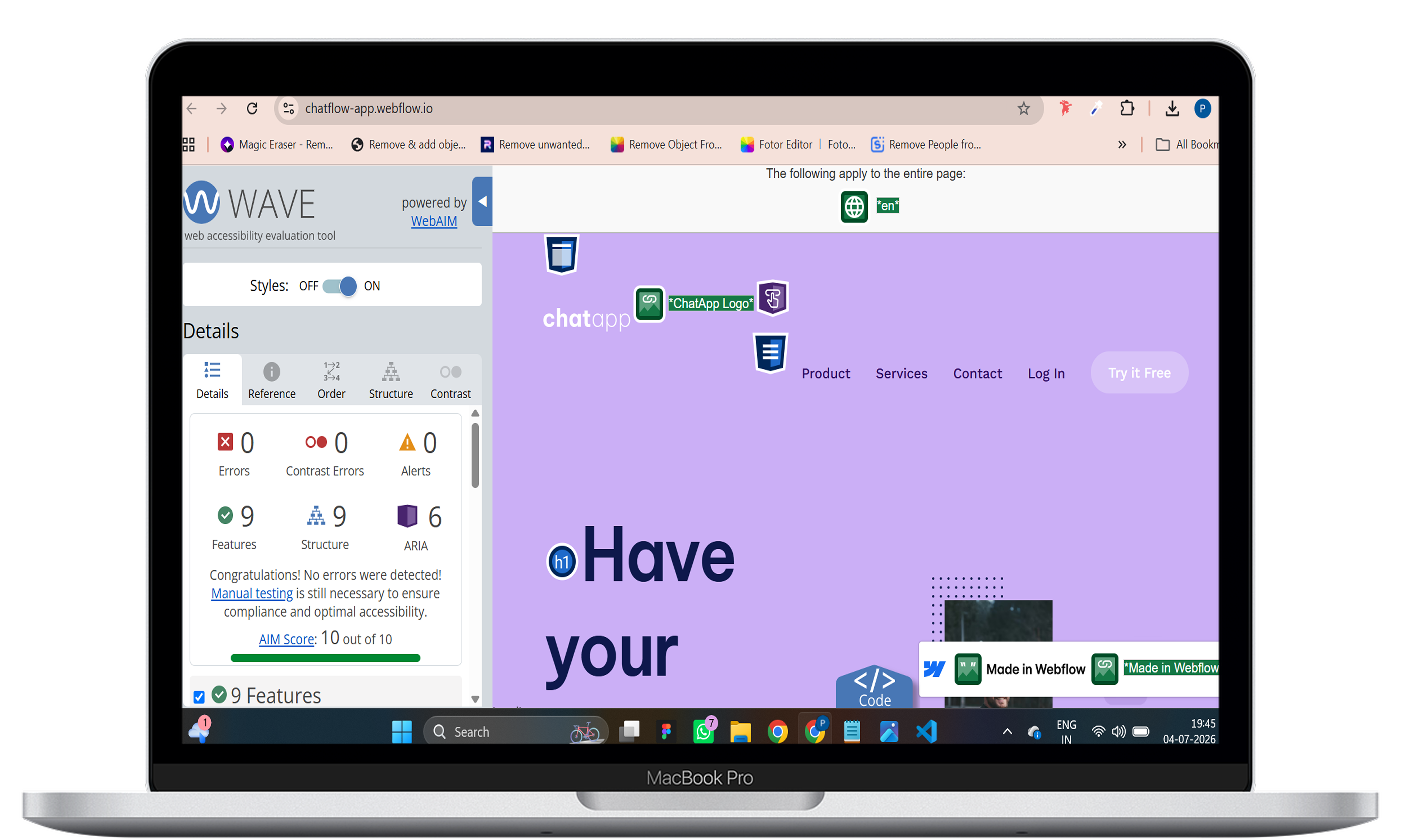
WAVE audit: the first pass flagged colour-contrast issues and a missing document language attribute. These were then corrected to improve readability, structure, and screen-reader interpretation.

What I fixed

  • Adjusted colour contrast to better align with WCAG AA
  • Set the page language for assistive technology and translation
  • Kept the layout and hierarchy clear for scanning and navigation

What I learned

Accessibility became part of the design process rather than a final polish step. It shaped the choices for contrast, hierarchy, and overall clarity from the start.

05 / Reflection

Reflection

What I learned

  • Visual hierarchy and consistency carry a landing page more than anything else
  • Building it live in Webflow showed how the design behaves on real screens and devices
  • Accessibility decisions improve both usability and trust

What I'd do next

  • Ground the copy in deeper audience research
  • Write sharper benefit-led messaging for the hero and CTA
  • A/B test the headline and primary button for higher conversion
  • Extend testing with manual keyboard and screen-reader review