UI / UX CASE STUDY
SmarKet — Student Marketplace
Every campus has a hidden economy of student creators with no
trusted place to sell. SmarKet is a campus-first marketplace built
around the one thing that actually stops a sale: trust through
verified storefronts, secure UPI checkout, live order tracking,
and reviews baked into every screen.
RoleUI/UX Designer
PlatformMobile App
TypeFull UX/UI Study
ToolsFigma
Marketplace
E-commerce
UX Design
View Prototype
Read the Study
01 / The Challenge
The Challenge
Walk across any college campus and you'll find a hidden economy
running quietly in the background. Someone bakes and sells out of
their dorm. Someone else paints, designs jewellery, or stitches
custom clothing. None of it shows up anywhere permanent it moves
through word of mouth, a stall at a college fest, a WhatsApp
broadcast, an Instagram story that disappears in a day.
That informality is charming until you look at what it costs the
people running these small businesses. A seller has no place to
look credible, no storefront, no order history, no way to prove
they've delivered before. A buyer has no way to tell a trustworthy
classmate from a stranger with a stolen product photo. Money
changes hands in cash or personal UPI, with no receipt, no
tracking, and no recourse if something goes wrong. SmarKet exists
to give this activity the one thing it was missing: a structure
that makes trust visible.
Who This Affects
-
Student creators with skill but no
infrastructure
-
Side-hustle sellers stuck reaching
only friends
-
Buyers with no reason to trust a
stranger
-
Campus bodies with no visibility
into any of it
What It Costs Each Side
For Sellers
- Scattered, informal selling with no central hub
- Limited reach beyond close friends
- No order or inventory management
- Unsafe, untracked cash / UPI transactions
For Buyers
- Hard to discover unique peer-made products
- No trust layer: no ratings, reviews, verification
- No way to follow an order once placed
- No room for sellers to grow professionally
"There is no dedicated bridge connecting student creators with the
local campus market — and no design brief hands you that gap
pre-solved."
02 / What I Wanted to Understand
What I Wanted to Understand
Before sketching a single screen, I needed to separate what I assumed
from what was actually true. I ran that thinking through a five-stage
design process, but the questions underneath it were the real starting
point:
Is the barrier lack of demand, or lack of trust?
Do students want a new app, or existing habits fixed?
What makes a buyer hesitate right before paying a stranger?
Do sellers need more reach, or more tools?
How much payment friction is too much?
Do buyers and sellers need one interface, or two?
Several of these had answers I didn't expect — the process below
is how I found out.
03 / Research & Discovery
Research & Discovery
I grounded this project in two layers of evidence: a peer study on
campus marketplaces already validated at scale (4.62 / 5 on
usability), and a direct survey of 50 college students on how they
currently buy and sell on campus. Together, they let me stop
guessing and start designing against real patterns, not just confirm
the idea was liked, but find out exactly where it still broke down.
From Findings to Design Opportunities
Demand vs. the Real Gap
Finding: the peer study scored 4.62/5 on
usability, demand for a campus marketplace wasn't in question.
Insight: the job wasn't proving the idea was
wanted, it was closing the specific gaps that stopped it being
fully usable.
Opportunity: build the transactional backbone
— payments, tracking, chat, the earlier concept lacked.
Visibility Over Talent
Finding: across the survey of 50 college
students, sellers weren't struggling for lack of skill, they were
struggling to be found at all.
Insight: for student creators, the bottleneck
isn't talent, it's exposure.
Opportunity: design discovery-first surfaces
search, filters, a browsable home screen, so good work gets found
by strangers, not just friends.
Trust Is the Currency
Finding: of the 50 students surveyed, hesitation
to buy wasn't about price or quality, it was about not knowing if
the seller was legitimate.
Insight: trust, not availability, is the real
currency of a peer-to-peer marketplace.
Opportunity: surface trust signals at every
decision point, not tucked away on a profile page.
Payment Isn't the Problem, Silence Is
Finding: UPI was the clear payment preference
among the 50 students surveyed, but they were uneasy sending money
with no confirmation of what happened next.
Insight: trust doesn't end at checkout, it has to
survive the wait for delivery.
Opportunity: pair familiar payment (UPI QR + COD)
with a visible, ongoing status tracker.
Key Insights
General marketplaces feel too broad
Trust is the real currency
Visibility, not talent, is the bottleneck
Simplicity beats feature overload
UPI preferred, but needs tracking
High demand confirmed (4.62/5)
Target Audience
Student Creators
Artists, bakers and designers who make handmade goods and want a
simple way to sell on campus.
Side Hustle Sellers
Students running a small business to cover living costs, who need
reach beyond word of mouth.
Curious Buyers
Students after unique, affordable handmade items from people they
already trust on campus.
Campus Community
The entrepreneurship cell, faculty and IT who support and oversee
student commerce.
"The sharpest insight: for student creators the bottleneck isn't
talent, it's visibility and trust. So SmarKet is built around
discovery and credibility, not just transactions."
04 / The Competitive Gap
The Competitive Gap
Students already described existing options as each solving part of
the problem and failing at the rest, the gap wasn't a missing feature,
it was a missing combination.
| Platform |
Strengths |
Why It Falls Short |
Opportunity |
| Instagram / WhatsApp |
Free, familiar, instant |
No carts, payments, or tracking |
Keep the social feel, add real commerce |
| Marketplace / OLX |
Large audience |
Generic, no student focus, safety risks |
Campus-only, verified space |
| Etsy |
Handmade trust, reviews |
Global, high fees, not local |
Handmade trust, hyper-local + free |
| Campus Stalls (study) |
Proven concept, 4.62/5 |
Limited payments & chat |
Add payments, tracking, live chat |
| SmarKet |
Campus-first + verified storefronts |
— |
Fills the gap: payments + tracking + chat + reviews |
The gap: no existing option is campus-first,
trust-rich, and genuinely simple all at once. Winning here didn't
mean out-featuring Etsy or out-reaching OLX, it meant being the only
option that is hyper-local, verified, and uncomplicated at the same
time.
05 / Turning Insight Into Requirements
Turning Insight Into Requirements
Every research finding needed to earn its place in the product. I used
user stories to keep decisions tied to specific people, and a MoSCoW
pass to keep the trust-and-visibility findings from getting diluted by
nice-to-have feature creep.
User Stories
Aarya · the seller
-
Set up my own storefront and list items with photos, so I look
professional and reach beyond my friends.
-
See one dashboard for pending, in-progress, and completed
orders, so nothing slips through.
-
Offer secure UPI, card, or COD options, so every transaction
feels safe.
Rohan · the buyer
-
Search and filter by category, price, and rating, so I find
unique items quickly.
-
Get real-time tracking, so I know when to expect pickup or
delivery.
-
See ratings, reviews, and chat with the seller, so I can buy
with confidence.
Card Sorting — Feature Prioritisation
Must Have
- Role-based sign up & login
- Storefront & listing management
- Search & filters
- Cart & checkout
- Secure payments (UPI / Card / COD)
- Real-time order tracking
- Seller dashboard
- Ratings & reviews
- Real-time chat
- Admin dashboard
Nice To Have
- Wishlist
- Sales & performance analytics
- Dispute resolution
- Loyalty & rewards
- Geo-location filtering
- Seller verification
- Native mobile app
Won't Have (yet)
- Third-party delivery logistics
- Multi-campus scaling
- AI recommendations
- Biometric / 2FA
- Off-campus public access
- High-volume wholesale
Broad Use Cases
Sell handmade goods or services on campus
Discover unique peer-made products
Request a custom, made-to-order piece via chat
Pay safely with UPI / QR or Cash on Delivery
Track an order from placed to delivered
Build a reputation through ratings & reviews
Manage listings & orders from one dashboard
06 / Design Exploration
Design Exploration
A few of the biggest decisions in this project didn't arrive fully
formed. Here's how three of them evolved.
Finding the Right Visual Identity
First idea: a clean, neutral
"marketplace-standard" palette cool blues and greys, like any
generic e-commerce template.
Issue found: it undercut the whole premise.
SmarKet exists because campus commerce is personal and handmade; a
cold palette made every product feel mass-produced, the exact
trust gap the platform was meant to close.
Final decision: warm cream & gold tones that
echo handmade craft, paired with Poppins headings and Inter body
text, a look that signals "this was made by someone" before a word
of copy does the work.
Structuring the Experience by Role
First idea: one shared interface for buyers and
sellers, with a toggle somewhere to switch modes.
Issue found: buyers and sellers have almost
nothing in common in what they need to do on any visit. Folding
both into one navigation model risked cluttering both experiences
to serve neither well.
Final decision: split the architecture at
sign-in, buyers land on a Home built for discovery, sellers land
on a Dashboard built for management, under one shared login.
Making Trust Survive Checkout
First idea: a standard checkout flow, cart,
payment method, confirmation screen, done.
Issue found: interviews showed trust doesn't end
when payment clears, it's tested during the wait afterward. A
confirmation screen that goes quiet leaves buyers anxious exactly
when they're most vulnerable.
Final decision: UPI QR + Cash on Delivery (no
card data stored), paired with a persistent order tracker running
from Processing to Delivered, reassurance without a single extra
message.
Once the role split was settled, the architecture followed naturally:
buyers land on the Home Screen, sellers go straight to the Seller
Dashboard, and each hub keeps its own navigation shallow and
predictable.
Site Map / Information Architecture
User Flows
Buyer Flow
Sign In → Home → Category → Product → Chat
→ Cart → Payment → Order Tracking
Seller Flow
Sign In → Seller Dashboard → Upload Product → My
Products
Interactions & Unhappy Paths
Different ways people interact
-
Browse by category, or search and
filter
-
Buy now, or add to bag for later
-
Chat to request a custom,
made-to-order piece
-
Pay by UPI / QR or Cash on Delivery
-
Switch roles: shop as a buyer, sell
from the dashboard
When things don't go to plan
-
Payment fails → retry or fall
back to Cash on Delivery
-
Product out of stock → Add to
Bag is disabled
-
No search results → empty
state with suggested categories
-
Seller slow to reply → chat
shows status, order still possible
-
Order issue → "Need help?
Contact seller" on tracking
Low-Fidelity Wireframes
Key journeys were mapped as a wireflow — each screen connects to
the next, mirroring the prototype paths from the Figma file.
07 / Key Design Decisions
Key Design Decisions
Each of these traces back to a specific research finding, not a
stylistic preference.
Warm Marketplace Identity
Problem: a generic e-commerce look would make
handmade, peer-made products feel mass-produced.
Decision: warm cream & gold tones that echo
handmade craft.
Reasoning: research showed the product's
differentiator was its human, handmade character.
Expected impact: a more approachable,
student-friendly experience that reinforces the product's
positioning.
Role-Based Experience
Problem: buyers, sellers, and admins need
different things, and one shared interface risked clutter for
everyone.
Decision: one login, three focused views.
Reasoning: interviews showed almost no overlap in
what each role needs to do per session.
Expected impact: cleaner, less cluttered
interfaces for every role.
Checkout with UPI QR
Problem: payment needed to feel secure and
familiar without adding friction.
Decision: UPI QR + COD, no card data stored.
Reasoning: interview data confirmed UPI as the
dominant habit; removing stored card data cut real and perceived
risk.
Expected impact: a checkout that matches existing
student behaviour instead of asking them to adopt a new one.
Order Status Tracker
Problem: trust visibly dropped in the gap between
"I paid" and "I received it."
Decision: visual bar: Processing → Shipped
→ Delivered.
Reasoning: buyers didn't need more messages from
sellers, they needed passive, always-available reassurance.
Expected impact: transparency that reduces
anxiety without extra manual effort.
Simple Seller Dashboard
Problem: students run this as a side activity,
not a full-time job.
Decision: add listing, my products, my orders,
buyer view.
Reasoning: seller interviews pointed to time
constraints, not a need for deep analytics.
Expected impact: a dashboard a student can
realistically keep on top of between classes.
Trust Built Into the UI
Problem: the old, informal system had no way to
establish credibility.
Decision: ratings, reviews, chat, tracking
surfaced everywhere.
Reasoning: research repeatedly identified trust,
not availability, as the primary transaction barrier.
Expected impact: a buyer never has to go looking
for reassurance, it's present at every hesitation point.
Final UI Designs
High-fidelity screens in a warm cream & gold system, with
Poppins headings and Inter body text.
View Prototype
Onboarding
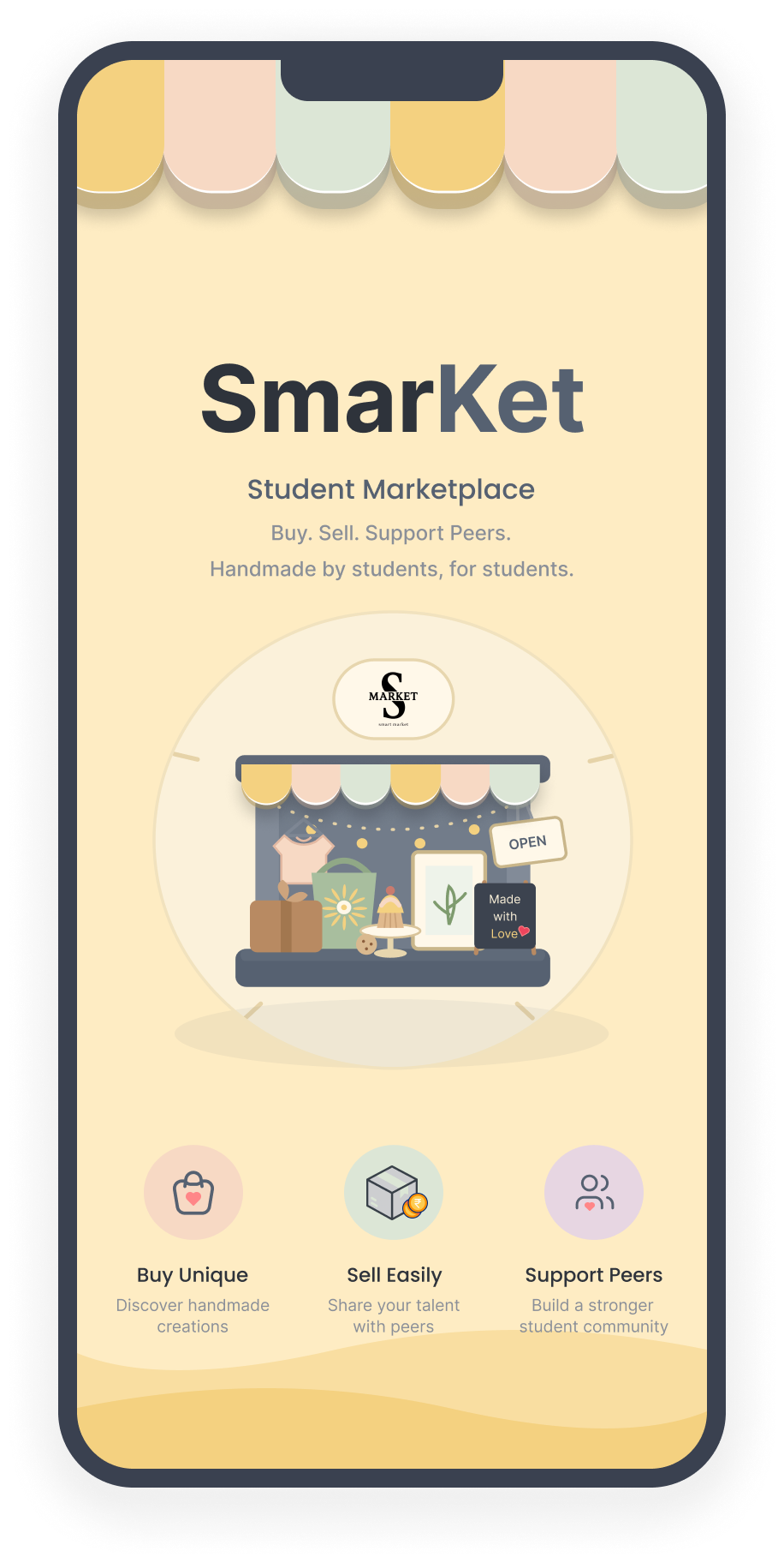
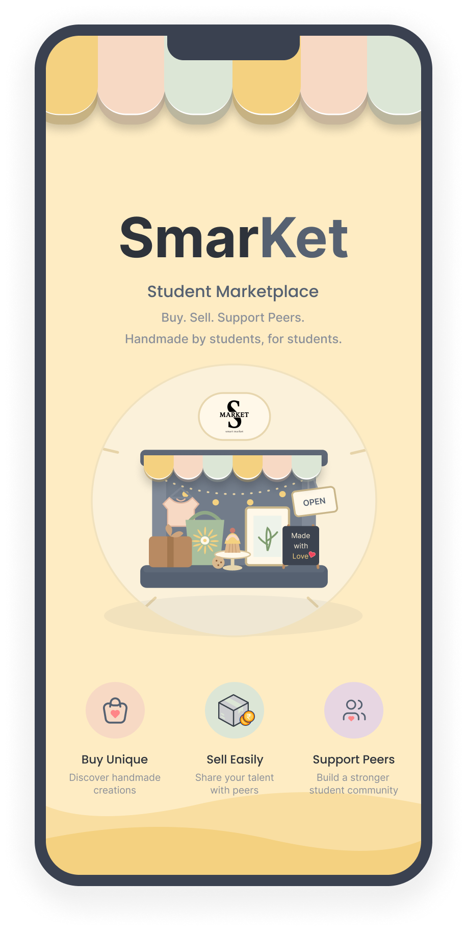
Splash
A clean splash screen introduces the SmarKet brand the moment a
student opens the app.
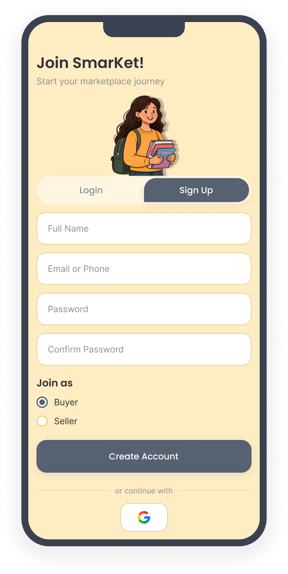
Sign Up
New users register with verified credentials and choose a role:
Buyer, Seller, or both.
Sign In & Home
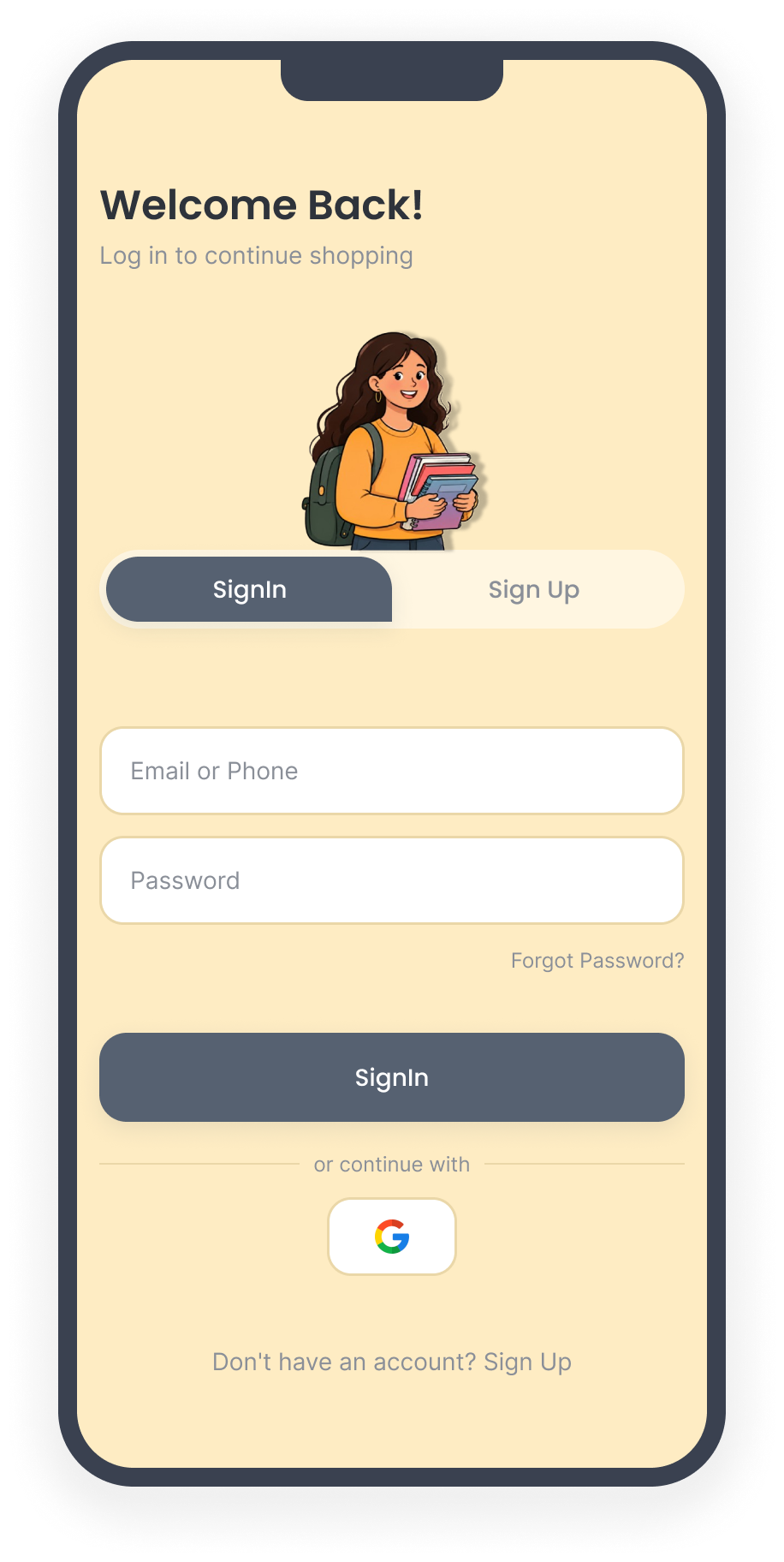
Sign In
Returning users sign in securely; a buyer lands on Home while a
seller is taken to the dashboard.
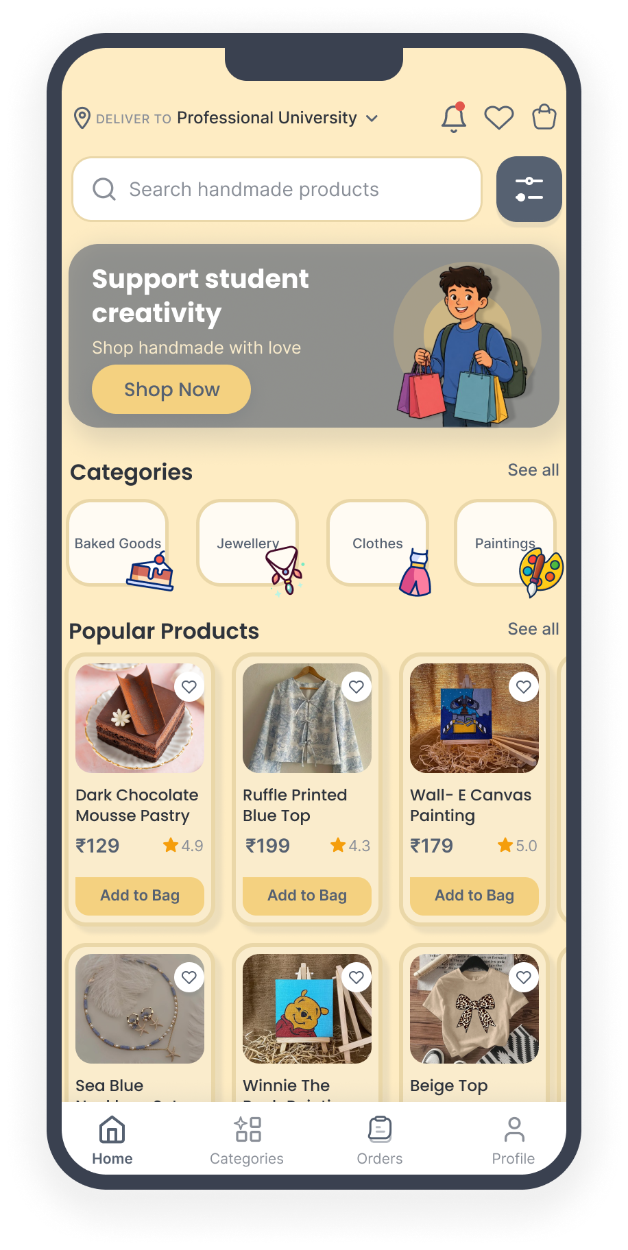
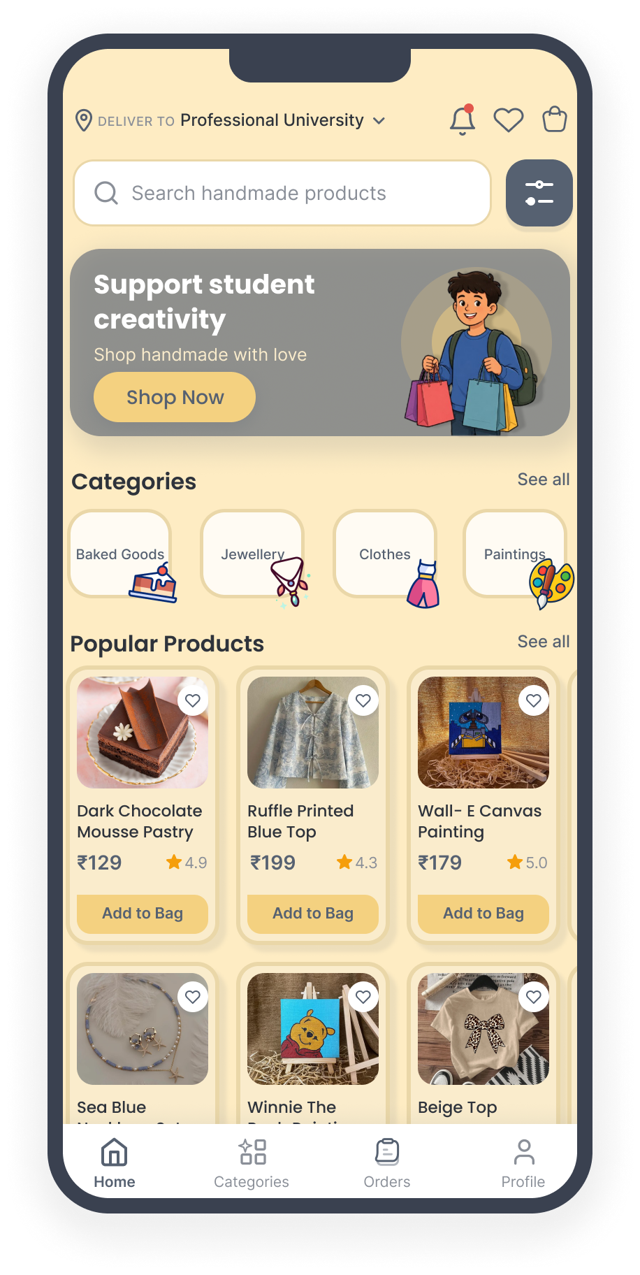
Home
Categories, search and popular products lead the home screen so
buyers find unique handmade items fast.
Browse, Product & Chat
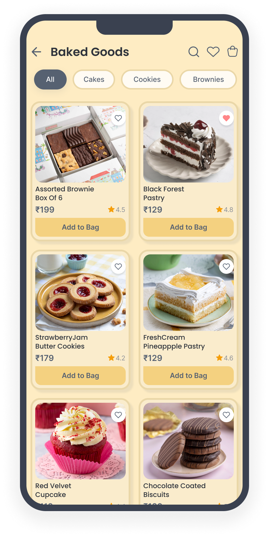
Category
Listings are grouped by category and can be filtered by price and
seller rating.
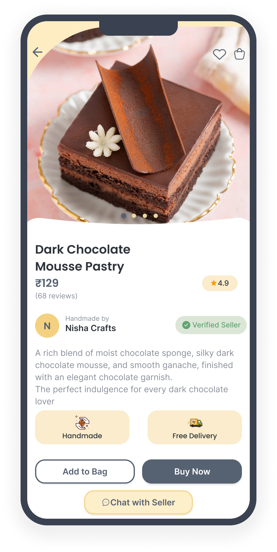
Product
Photos, price, ratings and a verified seller badge, with Add to
Bag, Buy Now and Chat with Seller.
Chat
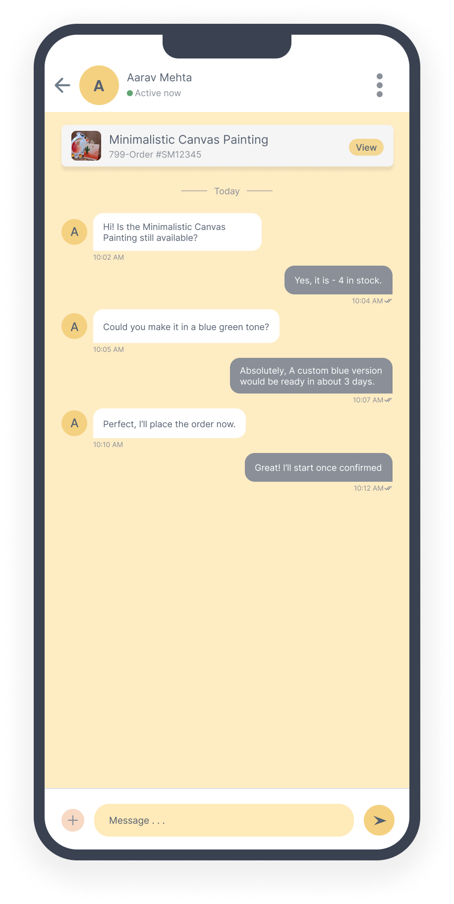
A real time chat connects buyers straight to the seller, so
shoppers can request custom, made to order versions of a handmade
piece before they buy.
Bag, Payment & Tracking
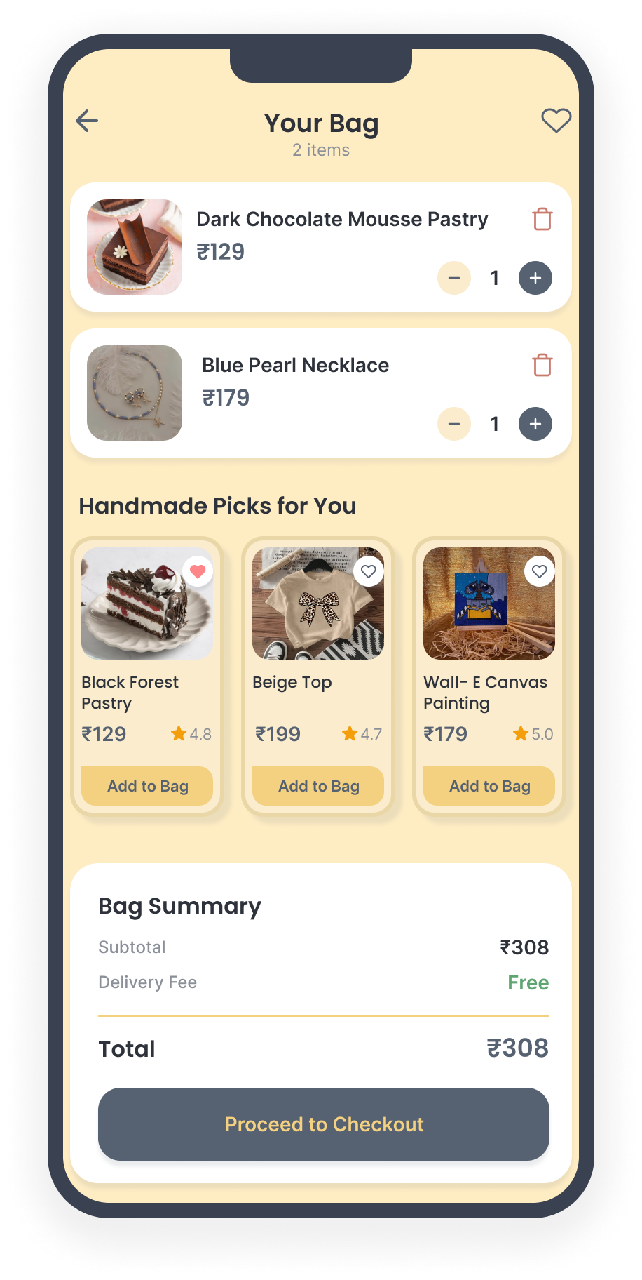
Your Bag
The bag lists chosen items with a clear summary and handmade picks
before checkout.
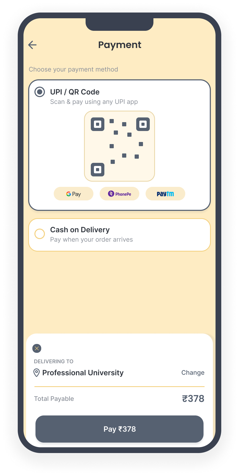
Payment
Secure checkout with UPI / QR and Cash on Delivery; no card
details are ever stored.
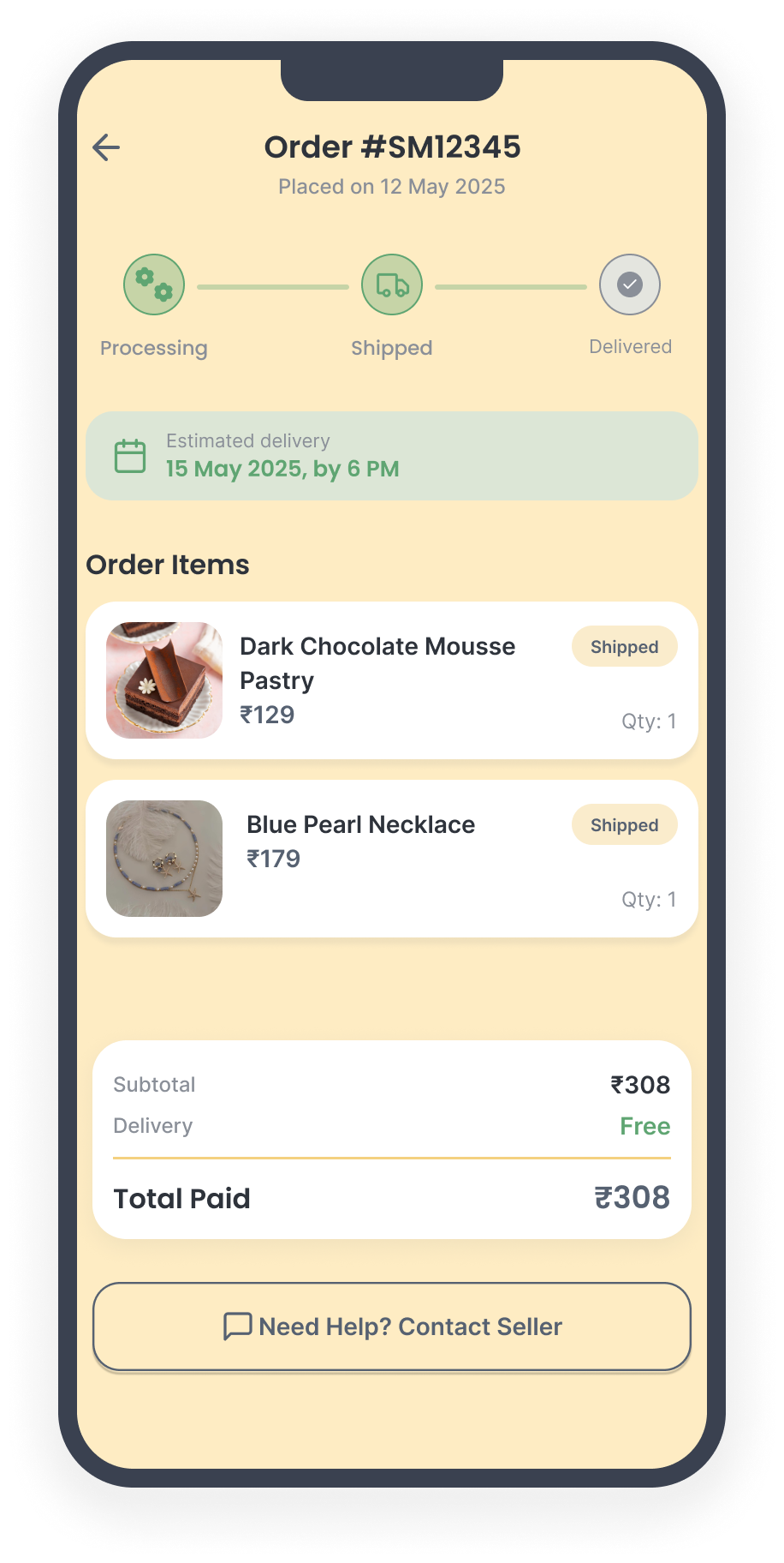
Order Tracking
A visual tracker follows each order through Processing, Shipped
and Delivered.
Buyer Profile & Notifications
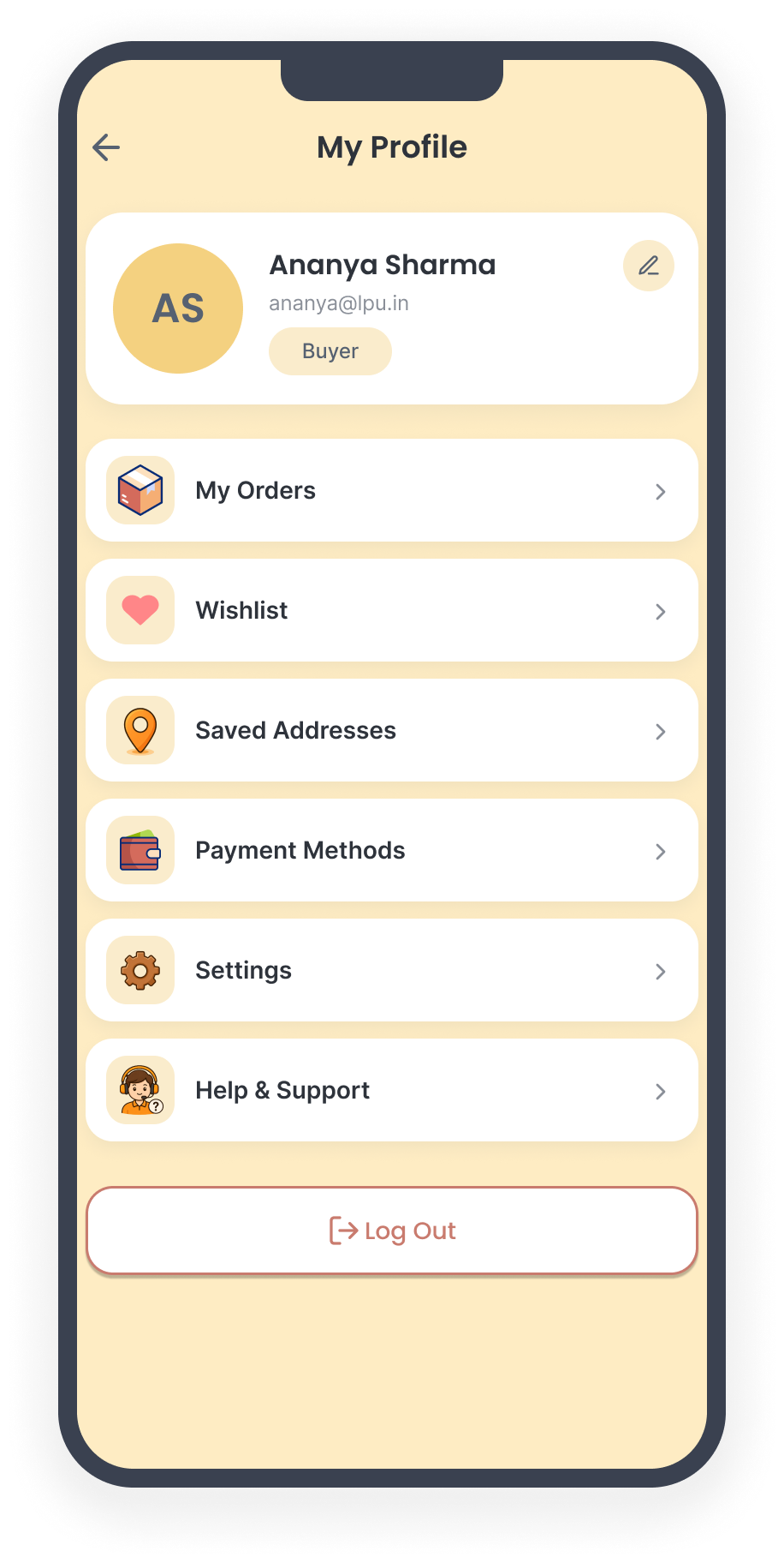
Profile
The buyer's profile holds account details, orders, saved
addresses, payment methods and settings.
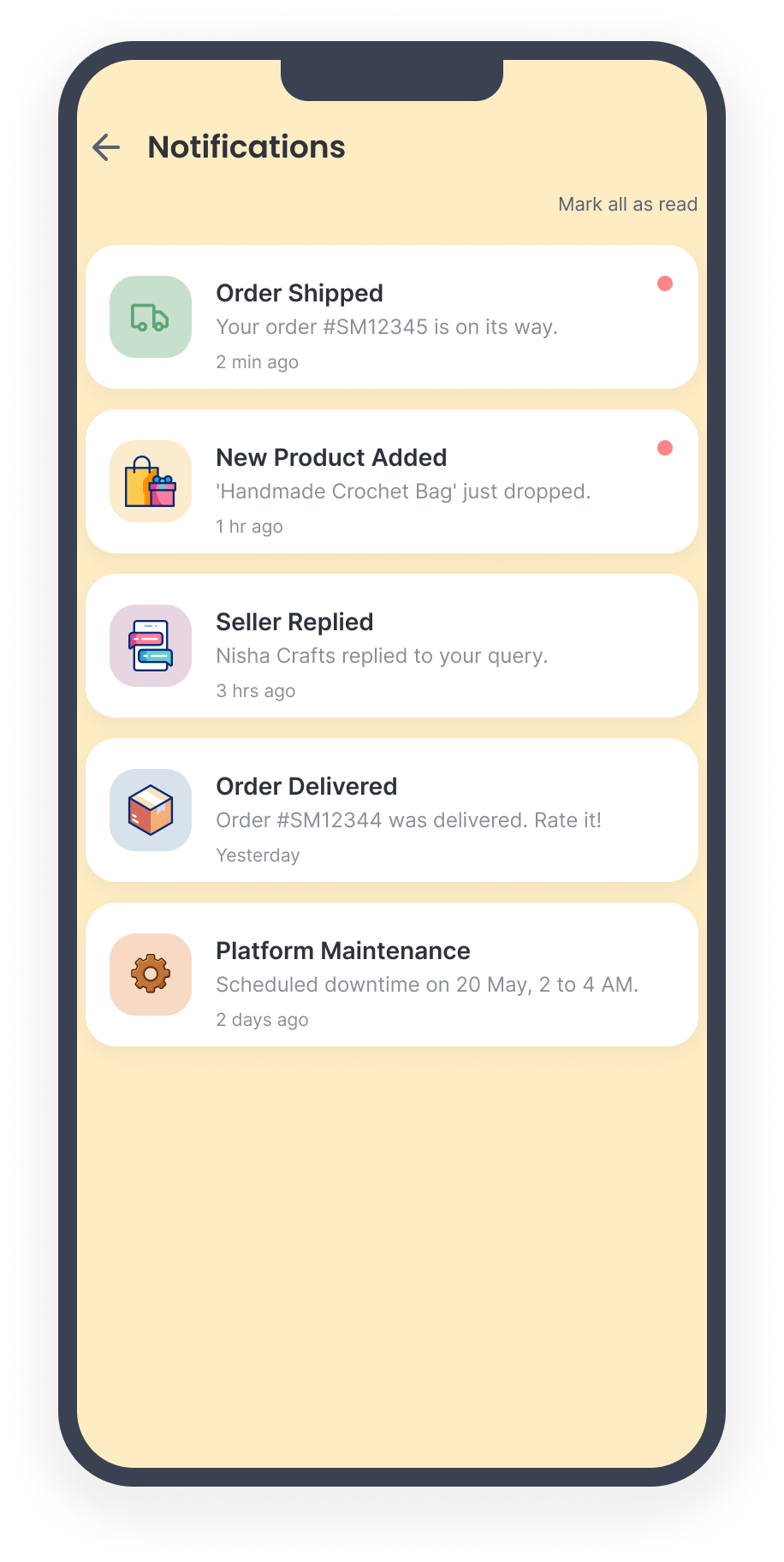
Notifications
Order updates and platform alerts keep buyers informed.
Seller Workspace
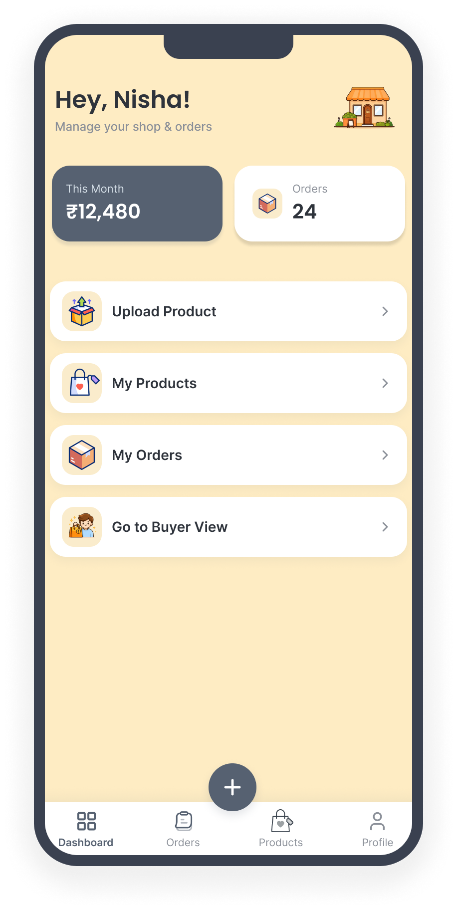
Seller Dashboard
On signing in as a seller, the user lands here to manage pending,
in progress and completed orders.
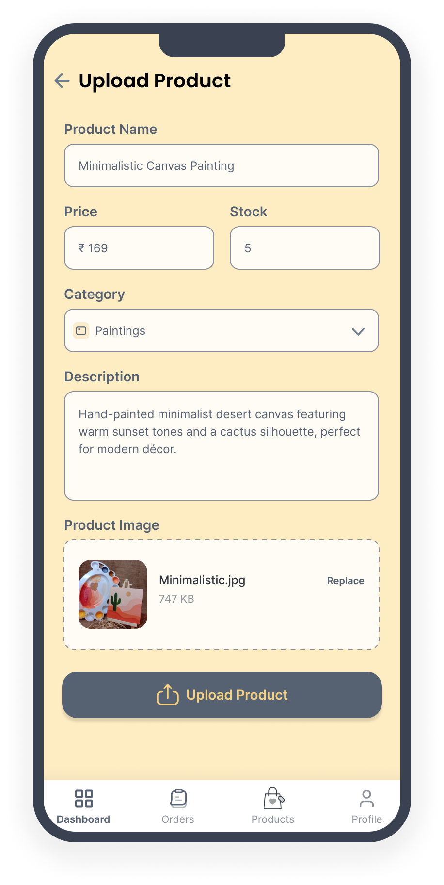
Upload Product
Listing a product takes a name, price, stock, category,
description and image.
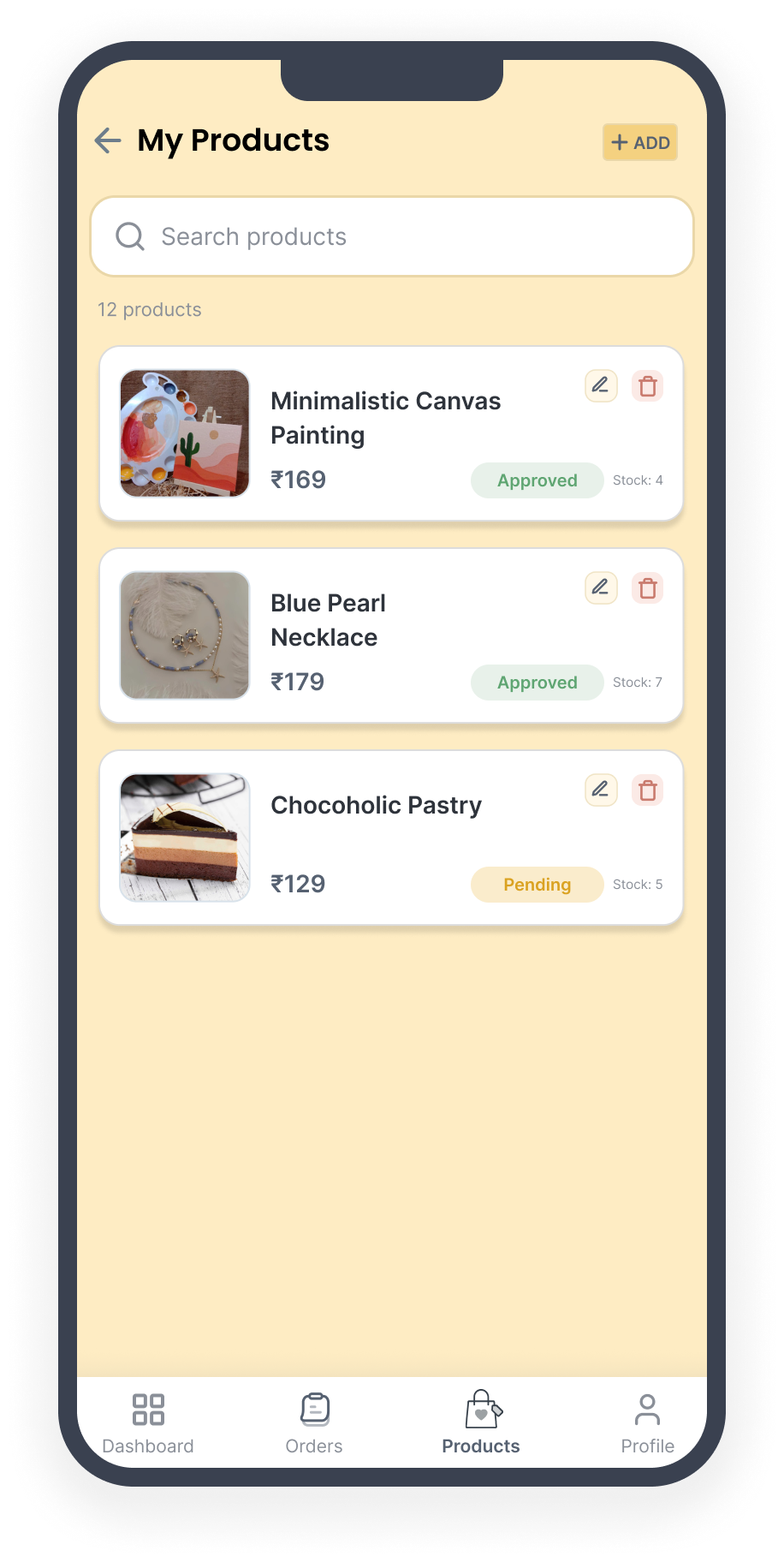
My Products
Sellers review and search their active listings at a glance.
08 / Design System
Design System
Consistency here wasn't just visual polish, every choice below ties
back to keeping the buyer-seller trust story coherent across two very
different role-based experiences.
Typography
Poppins carries headings, Inter carries body copy, a friendly,
rounded voice at a glance, while staying easy to read at small
sizes for reviews and chat.
Colour
Warm cream & gold, deliberately avoiding cool
marketplace-standard blues. Gold accents are reserved for trust
and status cues, so colour becomes a signal, not decoration.
Spacing
A consistent grid aligns product cards, listings, and dashboard
modules, so switching between buyer and seller views never feels
like switching apps.
Components
Reusable card patterns for products, orders, and listings; one
tracker component reused across tracking, notifications, and the
dashboard.
Accessibility: high-contrast text over the cream
background, clear disabled states (an out-of-stock product visibly
disables "Add to Bag" rather than allowing a dead end), and explicit
empty and error states so no one is left facing a blank screen with
no explanation.
09 / Testing & Validation
Testing & Validation
The high-fidelity Figma prototype was clickable but static, so rather
than run task-based usability testing against a live product, I ran
structured feedback sessions with a small group of students: each
worked through key flows, answered set questions, and shared open
reactions in the moment. That distinction mattered, it shaped what I
could validate, and I was careful not to overclaim completion metrics
I hadn't actually measured.
Flows Reviewed
Sign up and role selection
Browse, search and product view
Bag and checkout (UPI / COD)
Order tracking
Seller dashboard and listing
Before → Observation → Result
Role-Based Navigation
Before: the buyer/seller split was a structural
bet from interview data with 50 students, unconfirmed with anyone
actually navigating the prototype.
Observation: participants moved through it
naturally, without needing it explained.
Result: shipped unchanged, confirmed by both
research and observed behaviour.
UPI QR + COD Checkout
Before: designed on the assumption that
familiarity would outweigh any new friction.
Observation: most participants moved through
checkout without hesitation; a couple paused briefly before
confirming payment.
Result: flow retained; button labelling tightened
for clarity.
Order Status Tracker
Before: built on the hypothesis that visible
status would reduce post-purchase anxiety.
Observation: buyers specifically called it out as
reassuring after payment.
Result: validated as one of the most positively
received elements in the study.
Empty States & Seller Path
Before: functional but untested against real
navigation.
Observation: feedback flagged unclear error/empty
states and an over-long path into the seller dashboard.
Result: messaging strengthened, dashboard entry
simplified, for exactly the users with the least patience for
extra steps.
What I Heard & What Changed
What Resonated
-
Role-based home vs dashboard split
felt natural
-
UPI QR + COD checkout felt familiar
-
Order tracker reassured buyers
after payment
What I Refined
-
Clearer labels on primary buttons
-
Stronger empty and error states
-
Simplified path to the seller
dashboard
10 / Impact & Reflection
Impact & Reflection
What Worked
-
Treating trust as a design
material, not a feature, woven through ratings, tracking,
verified sellers, and chat
-
The buyer/seller role split, which
held up cleanly under testing
What I'd Improve
-
Move to genuine task-based
usability testing on a working build, not just self-reported
reactions
-
Give the seller workflow the same
depth of validation the buyer journey got
What I'd Test Next
Whether seller verification meaningfully moves buyer conversion
beyond ratings alone, it was scoped as "nice to have," not validated
directly. I'd also want to test the unhappy paths under real
conditions: does a buyer actually fall back to Cash on Delivery when
UPI fails, or abandon the purchase entirely?
"The most useful thing this project taught me: a marketplace isn't a
shopping app with extra steps, it's a trust machine with a shopping
cart attached. Once I started evaluating screens through that lens
instead of conventional e-commerce patterns, the right decisions
became far easier to defend."